
Now that you have created Form Sections on the set up Tab, below is the second step for setting up your form to completion. Notice, the VIEW FORM tab allows you to view the form you are creating throughout the creation process.
SET UP TAB -> FORM FIELDS
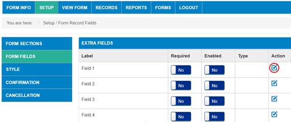
By default, all fields are contained within the EXTRA FIELDS section. Your new sections will not show until a field is assigned to it. The first step is to select the edit icon under the Action column for Field 1 (circled in red). From here you can select the sections you created in the previous step and assign each field to desired sections.
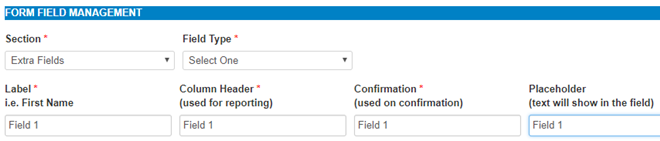
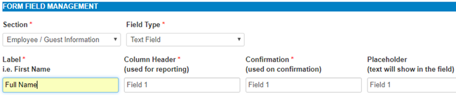
Once you select the edit icon, you are in the FORM FIELD MANAGEMENT:
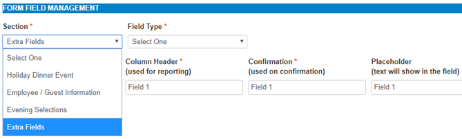
- Use the Drop down for SECTION to choose the section you want the field in
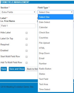
- Field type
- Date Select - Create a range of dates to select from a drop down
- Calendar - Creates a calendar to select a date from a span of many years
- Check Box - Creates check boxes that can have multiple selections applied
- Countries - Creates a drop down listing of default countries
- File Upload - Creates a tool that allows submitter to upload a document
- HTML - Creates the ability to add text within the form, no data collection
- Drop down - Creates a drop down field with added values you list for selection
- Email - Email field requiring a default email address template
- Number - Number field
- Radio Button - Creates radio buttons where only one can be selected
- States - Creates a drop down listing of states from the country you select
- Text Field - Creates a text field for submitter to type in entry (most used field)
- Text Area - Creates a larger text field for longer data entry
- Time Select - Creates a drop down listing of time in increments and range you select
- Name the field and carry that name across the following:
- Label (Displays the name of a field above or beside it on the actual form)
- Column Header (Displays field name in all Reports and Records)
- Confirmation (Displays in Confirmation when submitted and confirmation email)
- Placeholder (Displays in light gray within a text field on the actual form)
- Additional Check Boxes in Form Field Management Section:
- Hide Label - This allows you to hide the label beside or above the field
- Label on Top - By default, labels are located to the left of a field, this places label above the field
- Required - With field required, the submitter cannot submit without entering data
- Enabled - This displays the field, without selecting this, the field will be hidden
- Start Multi Field Row - This begins a row to add additional fields in horizontal line
- Add To Multi Field Row - This designates the remainder of the fields to the "start multi field row" field line
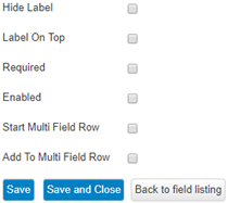
- Select SAVE AND CLOSE and go on to the next field until complete.
For more detailed instructions on creating Drop Downs, Radio Buttons and Check boxes, you can go to this article Creating Form Fields with Values
Once you have created all of your fields, you can go on to the next step - Form Style
Comments
0 comments
Article is closed for comments.